This branding project is for my brother, a therapist with no brand identity. He had previously not considered the importance of having an identity as a therapist and was content with a standard white business card displaying only his contact information. I wanted to show the type of person and therapist my brother is with this identity.
Sketches

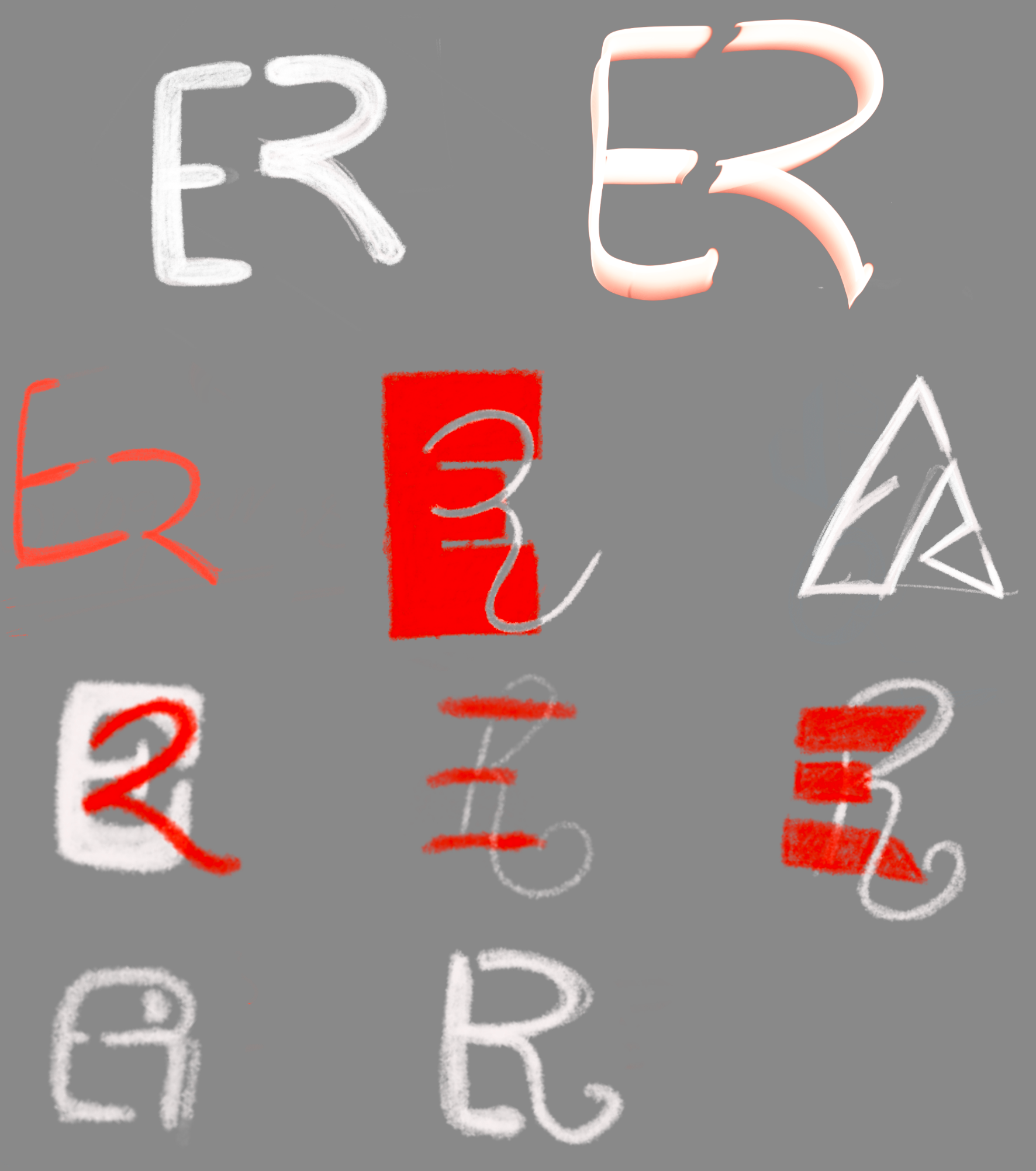
During my logo exploration, I created a monogram of his initials using his favorite color, red. However, many rough sketches did not communicate a monogram suitable for a therapist.
Finalized Design

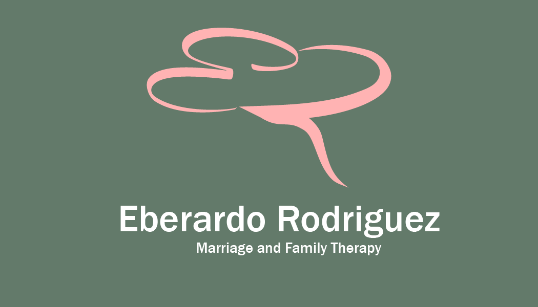
The finalized design turned into a logo using his initials from his signature and creating an abstract brain or thought bubble. The color red was changed into a light pink color to express the feeling of safety and approachability. Additionally, the shade of green refers to Mental Health.
Mockup

