Rosie's Tea Shop aimed to establish a visual identity inspired by K-pop culture, reflecting the vibrant and welcoming atmosphere of the shop. By designing a new logo, color palette, and typography, they sought to attract K-pop fans and enhance the overall tea shop experience.
Sketches


In my logo exploration, I focused on creating a playful design using hand lettering and incorporating fun tea motifs. I aimed to give the logo a personal touch rather than relying on a standard font. However, many of my lettering ideas didn't fully align with the tea motifs I wanted to include and the rough color palette idea I had in mind.
Finalized Design
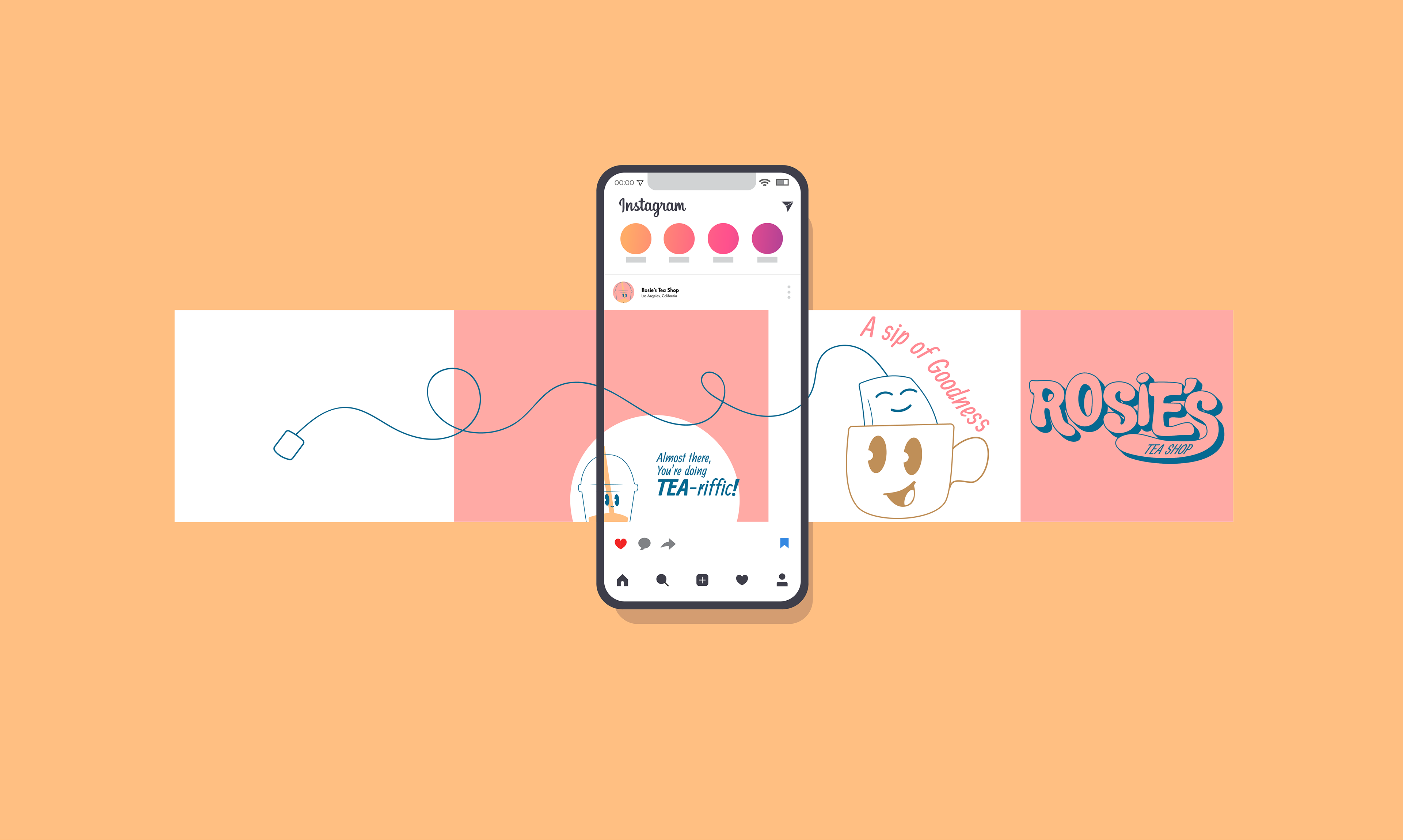
The final logo design included a font I found and customized to have a playful and welcoming feel. Additionally, it includes a flexible color palette to allow for various color combinations with the logo.
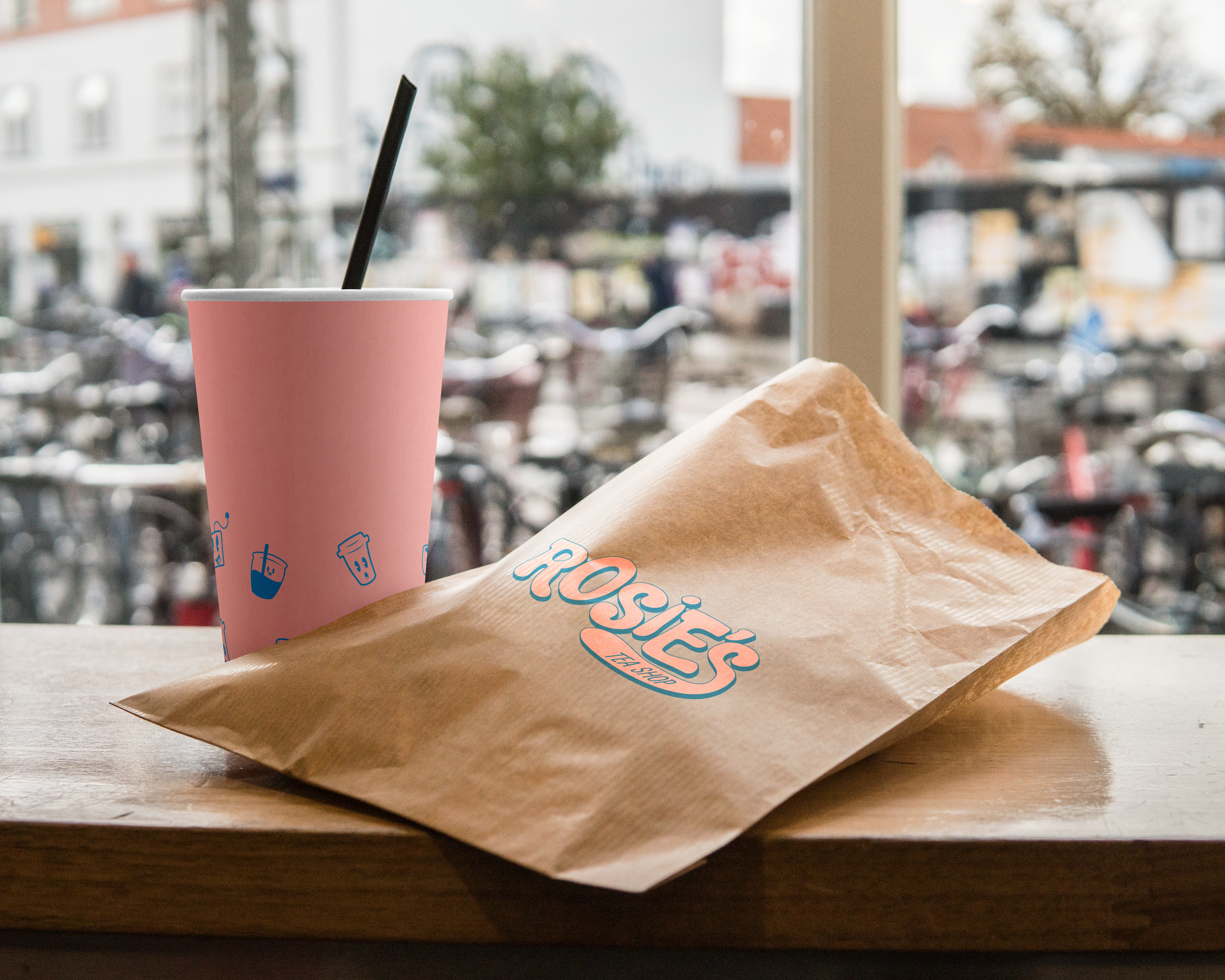
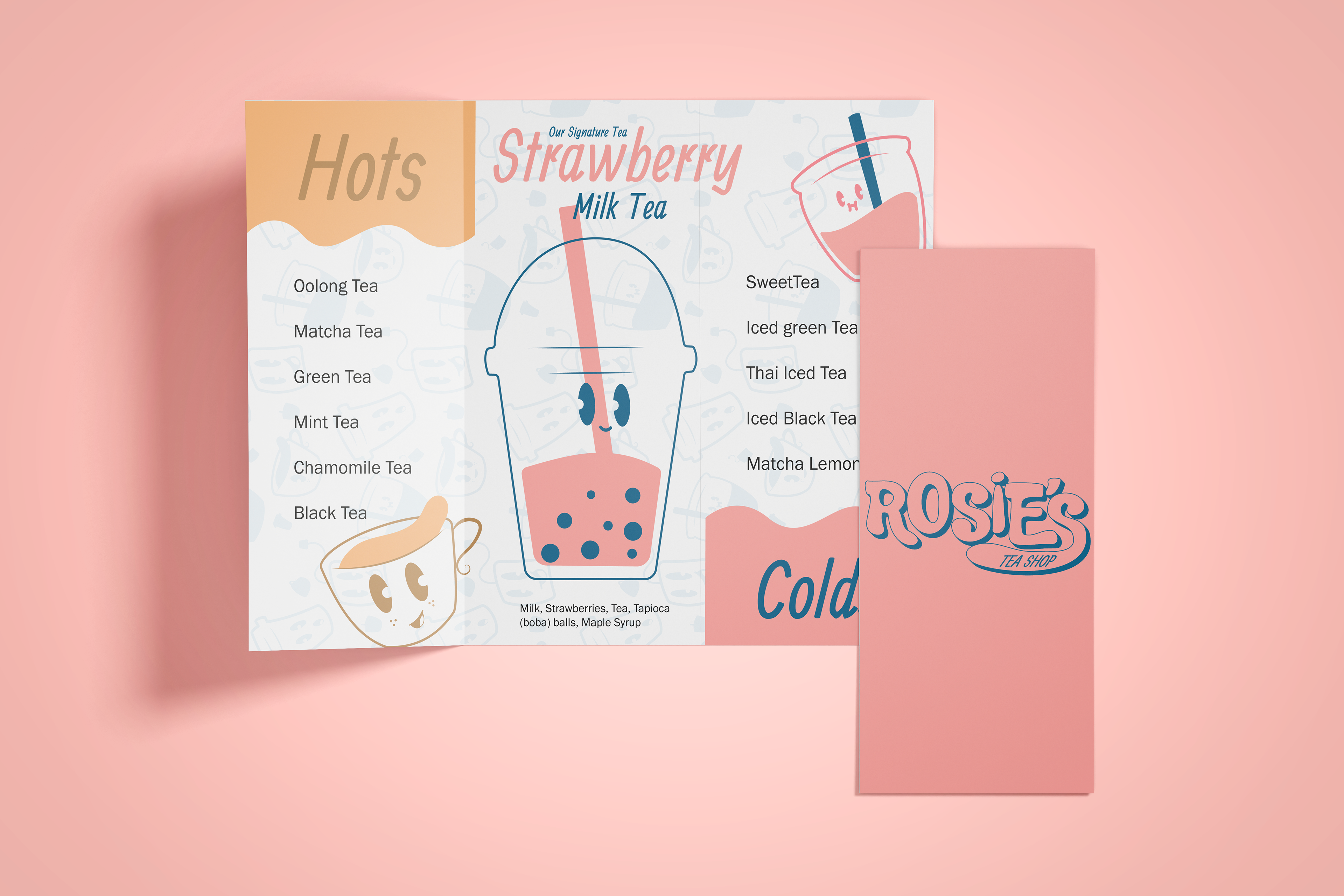
Mockups


